|
|
colors
Jun 22, 2009 21:54:04 GMT -6
Post by elchivoloco956 on Jun 22, 2009 21:54:04 GMT -6
i think its time to change the colors
dont get me wrong ,its bad ass but its getting a little old
|
|
|
|
colors
Jun 23, 2009 0:00:31 GMT -6
Post by La Fiera on Jun 23, 2009 0:00:31 GMT -6
NA I LIKE THIS COLORS THE RED STANDS OUT AND AND THE BLACK LOOKS GOOD WITH ANY COLOR THERE NEVER TO OLD THAT'S JUST WHAT I THINK**IRIS**
|
|
|
|
colors
Jun 27, 2009 2:10:43 GMT -6
Post by RGV Lowriders on Jun 27, 2009 2:10:43 GMT -6
hey guys, i'm always open to suggestions, but i think we need to stick to a certain theme and colors for the site, kinda like other popular sites, they aren't always changing their logos and stuff like that. i agree with elcaminos about the colors, at first the site was dark blue background with light blue letters, then i changed it to red and black and i think it looks good like that. i will try to see what i can improve and do it, i will try to add more to the site soon
|
|
|
|
colors
Jun 27, 2009 10:06:57 GMT -6
Post by MR.64RAG on Jun 27, 2009 10:06:57 GMT -6
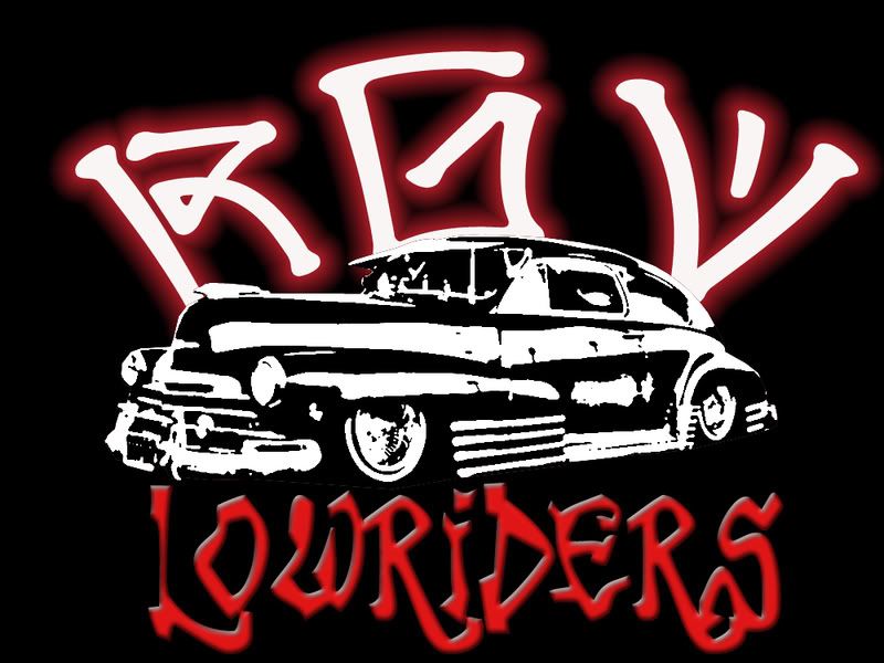
I'M SORRY BUT THE ONLY THING I WOULD CHANGE ABOUT THIS SITE WOULD BE THE RGV LOWRIDERS LOGO. I THINK IT LOOKS A LITTLE TOO CARTOONY AND UNPROFESSIONAL, PLUS THE GRAFFITI STYLE LETTERS DON'T HELP. I THINK ITS TOO STEREOTYPICAL THATS WHY PEOPLE ALWAYS THINK LOWRIDERS ARE GANGBANGERS AND TAGGERS AND SHIT. INSTEAD HOW ABOUT MAKING IT LOOK LIKE A LOWRIDER CAR CLUB PLAQUE OR SOME THING OF THE SORT. DOES ANYBODY HAVE ANY OTHER IDEAS. SORRY IF I OFFENDED ANY ONE WHO IS REALLY ATTACHED TO THIS LOGO AND I'M SORRY TO WHO EVER CREATED IT BUT THATS JUST MY OPINION.
|
|
|
|
colors
Jun 27, 2009 10:54:49 GMT -6
Post by __DIABLA__ on Jun 27, 2009 10:54:49 GMT -6
Leave the site the way it is[/color] ;D
|
|
|
|
colors
Jun 27, 2009 16:32:36 GMT -6
Post by Cruising Ink on Jun 27, 2009 16:32:36 GMT -6
Leave the site the way it is [/color] ;D[/quote]u don't a say so u have log in at least weekly or once a month lol |
|
|
|
colors
Jun 27, 2009 17:23:11 GMT -6
Post by RGV Lowriders on Jun 27, 2009 17:23:11 GMT -6
I'M SORRY BUT THE ONLY THING I WOULD CHANGE ABOUT THIS SITE WOULD BE THE RGV LOWRIDERS LOGO. I THINK IT LOOKS A LITTLE TOO CARTOONY AND UNPROFESSIONAL, PLUS THE GRAFFITI STYLE LETTERS DON'T HELP. I THINK ITS TOO STEREOTYPICAL THATS WHY PEOPLE ALWAYS THINK LOWRIDERS ARE GANGBANGERS AND TAGGERS AND SHIT. INSTEAD HOW ABOUT MAKING IT LOOK LIKE A LOWRIDER CAR CLUB PLAQUE OR SOME THING OF THE SORT. DOES ANYBODY HAVE ANY OTHER IDEAS. SORRY IF I OFFENDED ANY ONE WHO IS REALLY ATTACHED TO THIS LOGO AND I'M SORRY TO WHO EVER CREATED IT BUT THATS JUST MY OPINION. honestly, i like the logo that we had before this one |
|
|
|
colors
Jun 27, 2009 18:07:40 GMT -6
Post by Yeyo on Jun 27, 2009 18:07:40 GMT -6
This one? 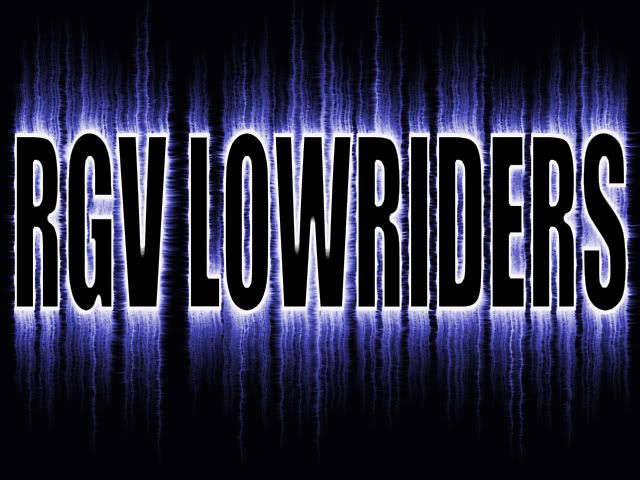 |
|
|
|
colors
Jun 27, 2009 20:11:48 GMT -6
Post by La Fiera on Jun 27, 2009 20:11:48 GMT -6
This one? LOOKS NICE YEYO I LIKE THE COLORS THE REALLY STAND OUT...  |
|
|
|
colors
Jun 28, 2009 1:33:55 GMT -6
Post by elchivoloco956 on Jun 28, 2009 1:33:55 GMT -6
OH YEA THETS A CHANGE THAT I CAN AGREE WITH
MAYBE WE CAN CHANGE IT UP A BIT AND LET THE MEMBERS CHOSE WHICH ONE THEY LIKE THE BEST
I LIKE THE BLUE MOST OF ALL
|
|
|
|
colors
Jun 28, 2009 2:07:03 GMT -6
Post by MR.64RAG on Jun 28, 2009 2:07:03 GMT -6
HELL YEA!! SOMETHING LIKE THAT. IT REALLY ATTRACTS YOUR ATTENTION AND CATCHES THE EYE.
|
|
|
|
colors
Jun 28, 2009 9:30:08 GMT -6
Post by Yeyo on Jun 28, 2009 9:30:08 GMT -6
Leave the site the way it is [/color] ;D[/quote] Haven't seen you in a while! How you been? |
|
|
|
colors
Jun 28, 2009 10:09:20 GMT -6
Post by Yeyo on Jun 28, 2009 10:09:20 GMT -6
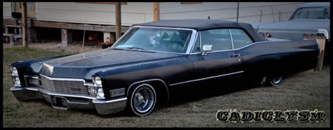
Yeah the electricity (blue) logo is the first one we ran for the website. I like it too.....only problem is it doesn't really lend itself for much integration. Meaning say we want to make a banner where the logo is right now, it's impossible with that one. I used the sticker design for this example: 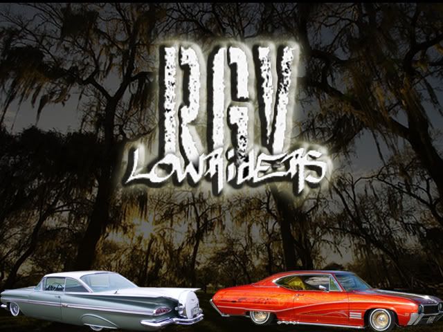 |
|
|
|
colors
Jun 28, 2009 14:25:07 GMT -6
Post by elchivoloco956 on Jun 28, 2009 14:25:07 GMT -6
either way, im just real happy that there is a place where we can go to unite the rgv
|
|
|
|
colors
Jul 4, 2009 18:59:38 GMT -6
Post by RGV Lowriders on Jul 4, 2009 18:59:38 GMT -6
Yeah the electricity (blue) logo is the first one we ran for the website. I like it too.....only problem is it doesn't really lend itself for much integration. Meaning say we want to make a banner where the logo is right now, it's impossible with that one. I used the sticker design for this example: damn that's nice, wish i could do stuff like that |
|
|
|
colors
Jul 4, 2009 19:15:33 GMT -6
Post by RGV Lowriders on Jul 4, 2009 19:15:33 GMT -6
what do you all think of the new colors and logo?
|
|
|
|
colors
Jul 4, 2009 19:23:23 GMT -6
Post by Cruising Ink on Jul 4, 2009 19:23:23 GMT -6
looks good son keep it for awhile ;D
|
|
|
|
colors
Jul 4, 2009 19:24:48 GMT -6
Post by RGV Lowriders on Jul 4, 2009 19:24:48 GMT -6
thanks dad, LOL!!!!
|
|
|
|
colors
Jul 4, 2009 19:25:56 GMT -6
Post by RGV Lowriders on Jul 4, 2009 19:25:56 GMT -6
i think the RGV Lowriders logo on this one is the one we should keep, maybe if Yeyo could just change the cars and background every month, that could be cool too
|
|
|
|
colors
Jul 4, 2009 19:27:59 GMT -6
Post by RGV Lowriders on Jul 4, 2009 19:27:59 GMT -6
just for info, the only colors i can use are shades of blue, red, greenish to aquas, and the rest are flourescent pinks, blues, and greens, so i don't have too many choices, i think this teal looks good though
|
|