|
|
Post by RGV Lowriders on Apr 15, 2008 9:31:20 GMT -6
reason i ask is cause i saw Yeyo's signature and i like it, plus i always like black as the background for any website. if you all decide to change it, then the site will be black background with either red or white fonts, and either red or white borders
help me out guys
|
|
|
|
Post by 42fleetline on Apr 15, 2008 11:29:50 GMT -6
I don't mined the way it is, but hey if you want to make changes go for it, all I want to see is the site staying alive and representing.
|
|
|
|
Post by Yeyo on Apr 15, 2008 14:41:21 GMT -6
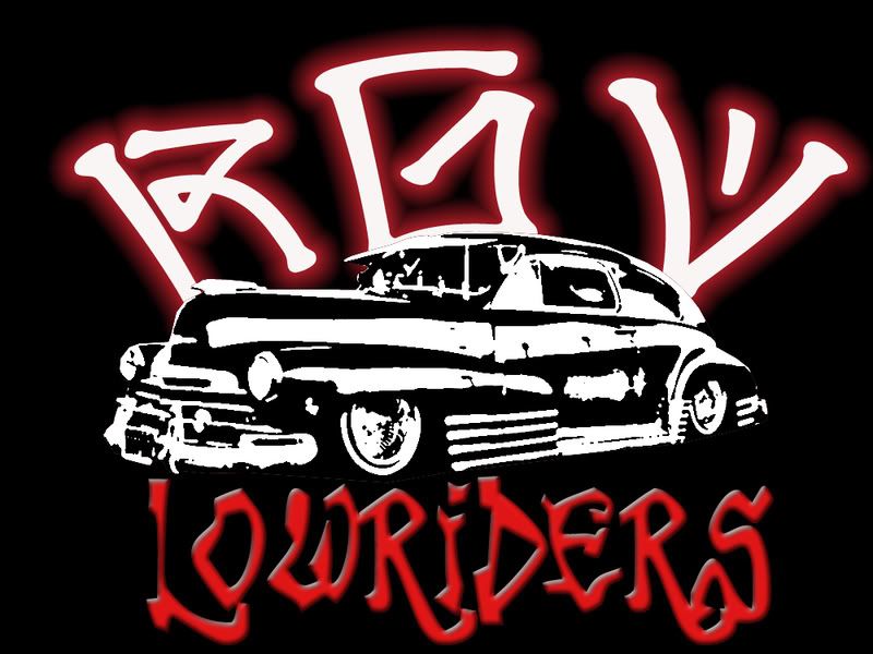
Here's the logo Noe's talking about:  I say go for it, freshen up the site a bit. |
|
|
|
Post by RGV Lowriders on Apr 15, 2008 19:14:05 GMT -6
I don't mined the way it is, but hey if you want to make changes go for it, all I want to see is the site staying alive and representing.  |
|
|
|
Post by RGV Lowriders on Apr 15, 2008 19:34:44 GMT -6
alright, it's not done but i'll keep working on it, i'm not home so i'll finish it when i get there
any comments anyone?
|
|
|
|
Post by RGV Lowriders on Apr 15, 2008 20:24:09 GMT -6
so what does everyone think? yay or nay?
|
|
|
|
Post by Cruising Ink on Apr 15, 2008 20:40:52 GMT -6
its different  |
|
|
|
Post by RGV Lowriders on Apr 15, 2008 20:41:59 GMT -6
what you talking about?
|
|
|
|
Post by Cruising Ink on Apr 15, 2008 21:28:50 GMT -6
sorry im not into the color red but it looks alright
|
|
|
|
Post by Yeyo on Apr 15, 2008 21:38:03 GMT -6
OH SHIT!!! Looks BAAD!! I don't know if the ladies from the site will like it though? Did you try switching the red with whites? HA! I like it  |
|
|
|
Post by Yeyo on Apr 15, 2008 21:40:01 GMT -6
BTW, I don't know how other people feel about the colors, but I think we should stick to the new logo. It's a lot cleaner and easier to recreate if we ever decide to make shirts or stickers in the future. My .02
|
|
|
|
Post by __DIABLA__ on Apr 15, 2008 23:32:58 GMT -6
I'm down with it......Black, Red and White is my favorite combination. ;D
|
|
|
|
Post by __DIABLA__ on Apr 15, 2008 23:34:18 GMT -6
Just a suggestion though......I am feelin the graffiti font but that particular one is kinda whack.
|
|
|
|
Post by Yeyo on Apr 16, 2008 0:12:36 GMT -6
Let me see if I can find something to replace it with.
|
|
|
|
Post by Yeyo on Apr 16, 2008 0:52:33 GMT -6
|
|
|
|
Post by 42fleetline on Apr 16, 2008 6:39:41 GMT -6
DAMMMMM am I seeing red or is that red. looks good. As for the logo Yeyo I favor the logo in the middle. but hey thats just my thought. |
|
bigmac
Still a Rookie

Posts: 157
|
Post by bigmac on Apr 16, 2008 8:57:32 GMT -6
I think it looks awsome. The color combination is the shiznit! where do you get the graffitti yeyo.
|
|
|
|
Post by RGV Lowriders on Apr 16, 2008 9:30:37 GMT -6
thanks for the compliments guys, but even more thanks to Yeyo for coming up with the new logo, it's what inspired the colors
|
|
|
|
Post by RGV Lowriders on Apr 16, 2008 9:32:16 GMT -6
OH SHIT!!! Looks BAAD!! I don't know if the ladies from the site will like it though? Did you try switching the red with whites? HA! I like it what do you mean about switching the reds to whites? i changed the "visited link" from purple to white, which means if you already checked out that topic it will show it white, red means you have not checked it out |
|
|
|
Post by Yeyo on Apr 16, 2008 10:41:30 GMT -6
DAMMMMM am I seeing red or is that red. looks good. As for the logo Yeyo I favor the logo in the middle. but hey thats just my thought. That's the one I like too ;D I think it looks awsome. The color combination is the shiznit! where do you get the graffitti yeyo. I get them from different sites, just google "graffiti fonts" this particular site has some nice ones though simplythebest.net/fonts/index.htmlthanks for the compliments guys, but even more thanks to Yeyo for coming up with the new logo, it's what inspired the colors Para eso estamos. And about the colors, that's what I meant. I just hadn't noticed it yet. Ahi quedo! We just got to switch out the logo now. |
|